Project Overview
Chemnitz Campus Guide is an informative app platform designed to identify specific problems faced by new international students and help them with information and tasks they need to complete in the first phase to feel comfortable in their new environment. Overall, it should be helpful for every student in their daily life.
The motivation behind CCG
In most cases, students do not receive personalised attention and tailored guidance. Instead, they require early intervention to identify their issues and an effective support program to bridge the gaps in their learning. Also, due to language limitations, their resources are limited.
In addition, there are not many online apps targeting students. Therefore, I was motivated to develop an online platform to solve the above problems. Being one of them myself, I can empathise well with their situation.
User Research
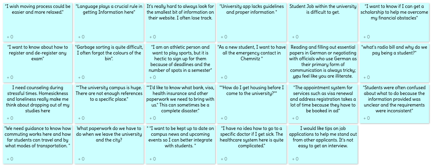
When someone wants to study in Germany or any other country, there are many obstacles faced in daily life: language, commuting, culture are part of the challenge, but there is a more complex situation they can face - regulations and legal formalities. For this reason, we analysed the problem and looked for solutions as a team, which led us to our most valuable findings. As part of our user research, we conducted several interviews with students from different demographic groups to learn about the challenges they face, their experiences, and their motivations.The data collected was documented as observations.
As secondary research, I also read many blogs and researched the internet, learning a lot about the need and availability of online platforms to support students who are new to Germany.
Idea Box
Ideate
We began to group our ideas and put them into the proper categories as a team. After discussing our ideas, we understood better the challenges students face and the solutions they seek. The challenge was to develop an app that would provide an innovative solution to the complex problem students face by incorporating principles such as aesthetic usability, ease of navigation between screens, readability, affordability, and minimal power consumption and clicks.
Due to the diversity of audiences, the biggest challenge in developing a universally applicable app was not to complicate the design process.
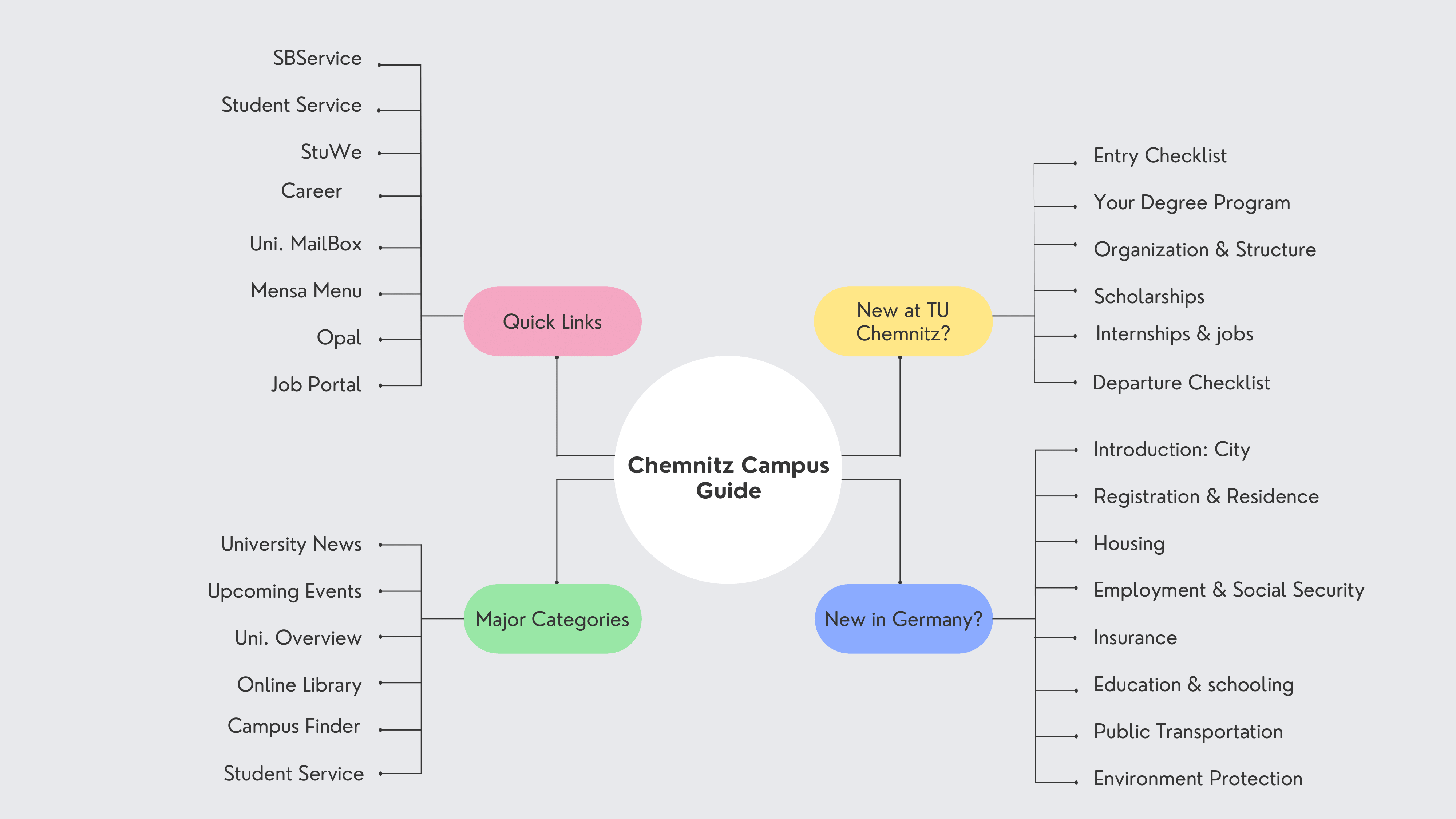
Before I began sketching wireframes, I conducted an open card sort to determine the information architecture of the app. The data from the card sort helped en identify potential improvements to the current design concept, and revealed some navigation paths that were absolutely necessary. With these findings, a site map was created.
Idea Box
Visual Design
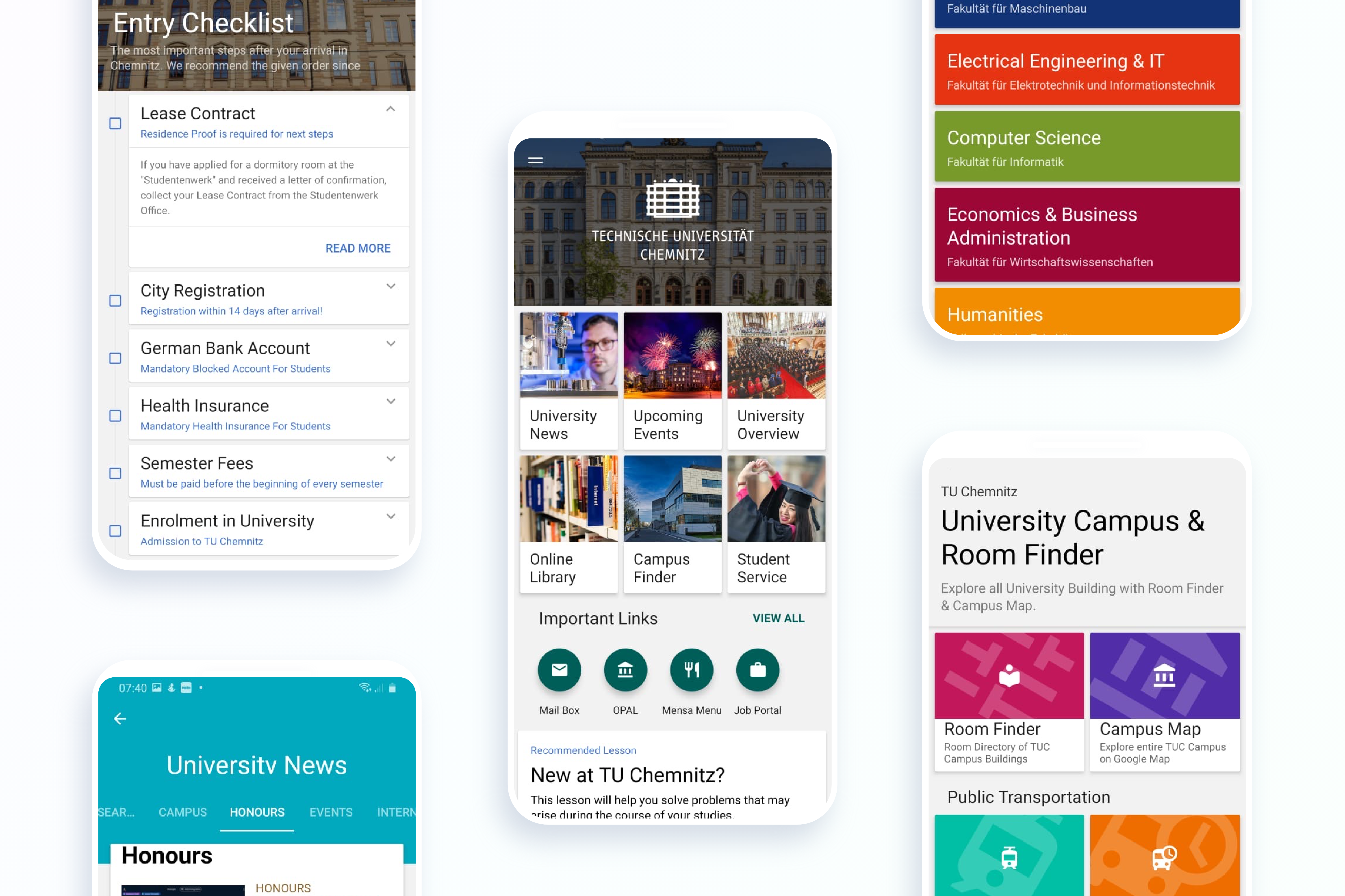
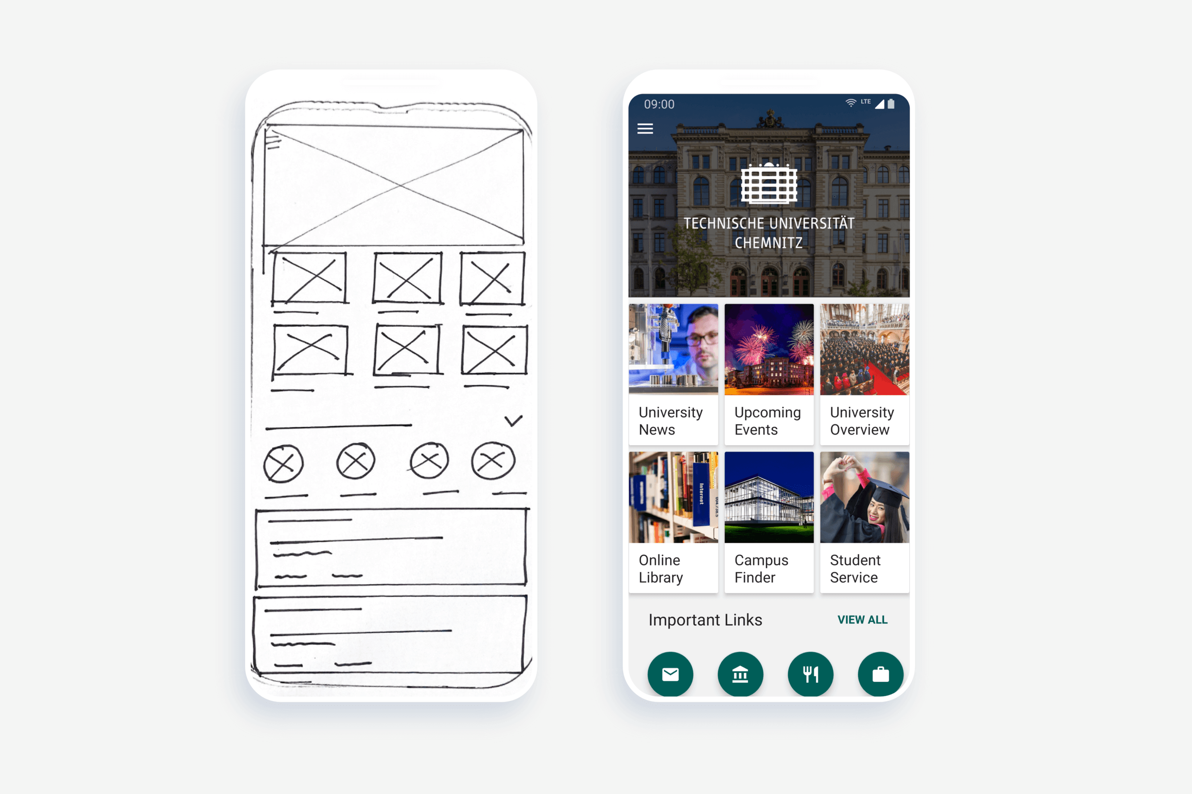
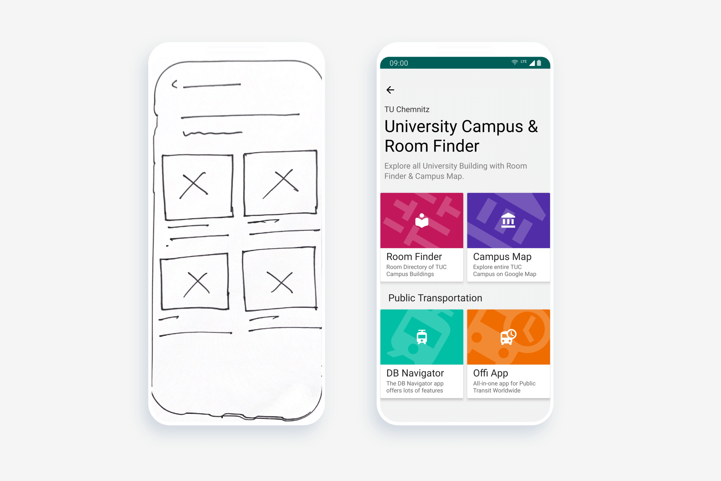
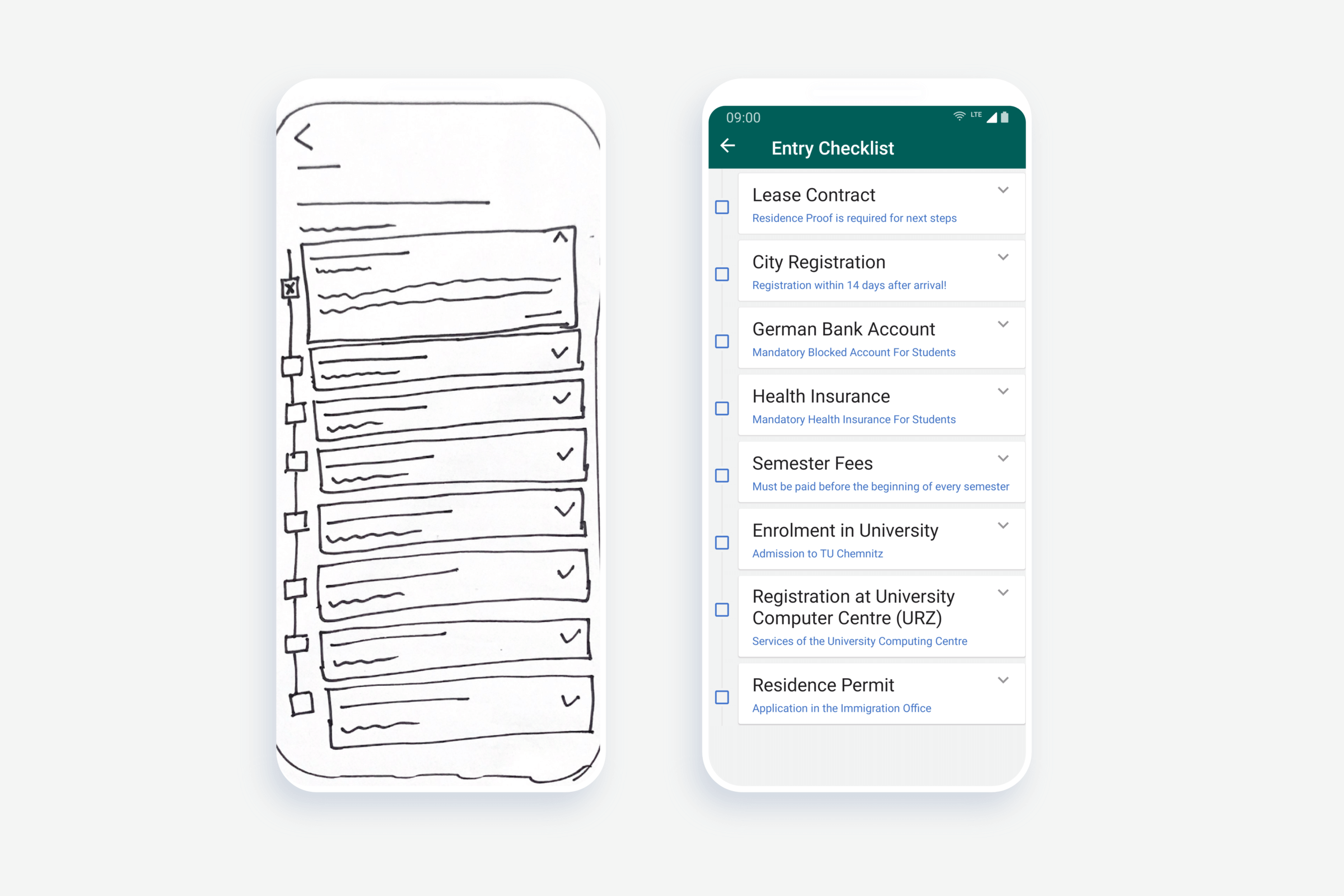
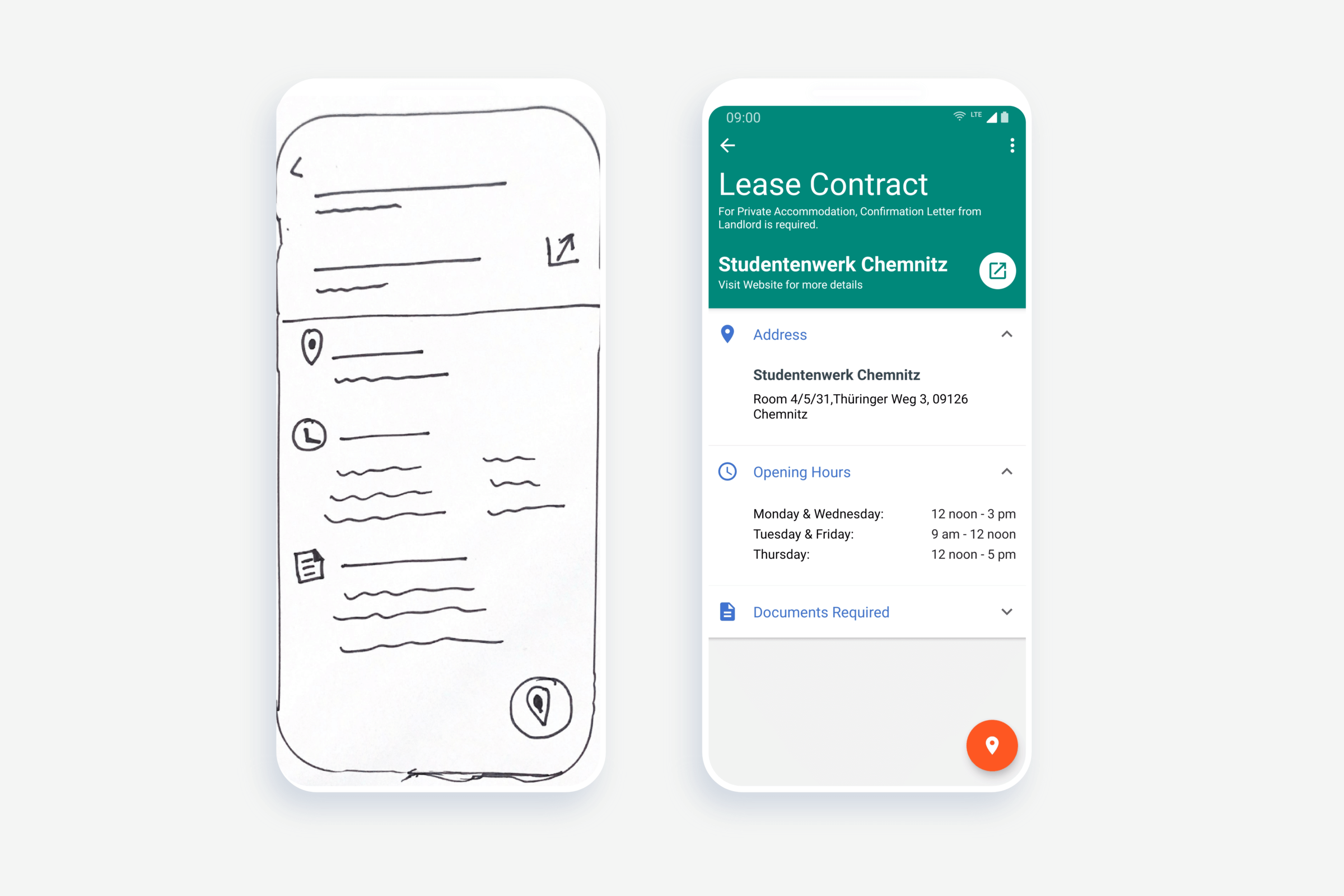
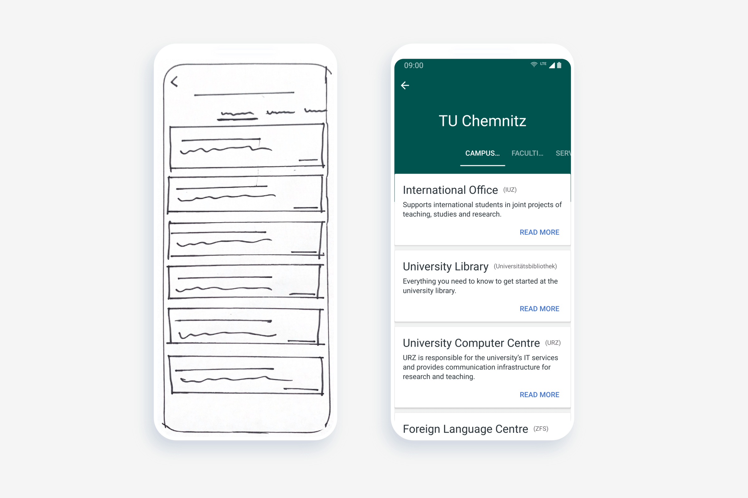
The first step to designing the landing page was to quickly sketch out my ideas onto paper. Anything goes in paper sketches. They’re quick and easy, and would help me see if my ideas are worth developing further. This visual guide is the basic framework of the app. It helped me arrange the user interface elements while focusing on functionality rather than how it looks. The simplicity of wireframes also allows me to test ideas quickly without having to dive into the details.
For realistic interactivity, I move to a high-fidelity prototype as I approach the final design in terms of features and functionality and have considered the useful comments from the usability testing.
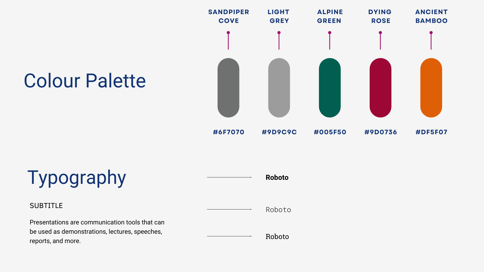
Style Sheet
The color of the style sheet is based on the primary color of the university website, i.e. alpine green mixed with the secondary color light gray. The typography of the text roboto is used to make information clear and visually appealing to the reader. Through constant brainstorming, searching for inspiration, and many, many revisions, I was able to better achieve this balance by focusing on the details. I made sure to place each element intentionally to create a simple, consistent, and seamless design.
Demo Video
Future Iterations
After user testing, I realized that users were expecting some more features in the app. Since the prototype is intended to be a Minimum Viable Product (MVP), many features were excluded in the design for future iterations.
My Learning
This project has improved my problem-solving skills and the idea has been developed by thinking about the user perspective. Refining and redefining the product and user flow based on usability testing will help the product stand out from the competition by iterating from the idea stage until students recognize it as the solution presented.
I am pleased with the outcome of the Chemnitz Campus Guide and strongly believe that this app is a solution to the international student and will be adopted by the target users.